Slide design (p2) changes with time. Consider today and what is regarded as the norm for a slide and then consider how “Presenter” (powerpoint) started back before the Internet. At times design throws us back to a time when things were considered old fashioned and the hipster culture is a perfect example of this, the retro look.
I would like to consider this retro-look in slide design and propose this design for any presentation you might be giving today.
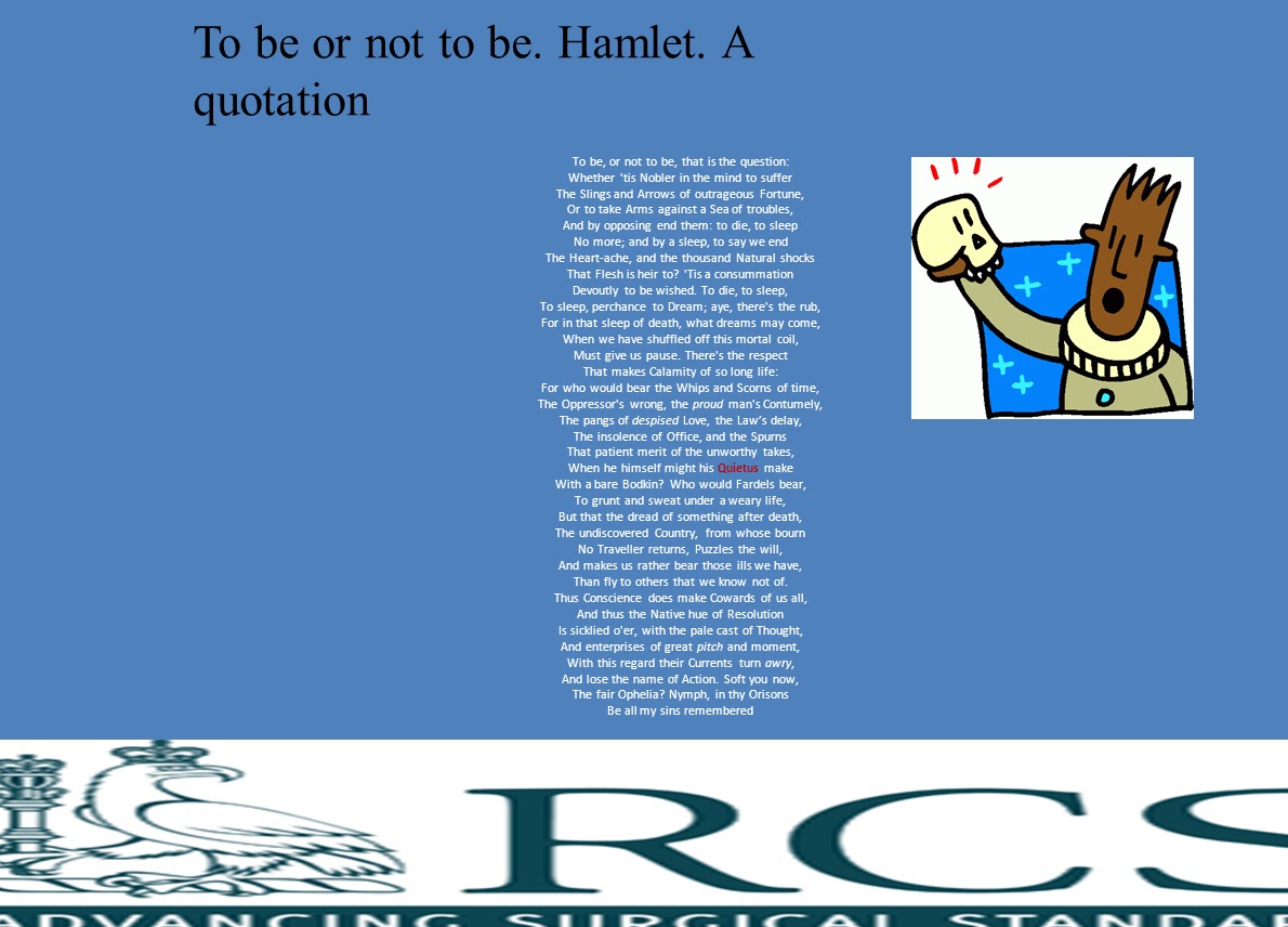
Design should capture attention and provide function from form. The title explains the nature of the slide below, mirrored by the ironic clip art. Its fractured look adds to the discussion at hand. Use of Times New Roman font harks back to a time before and really small font helps the reader to read and not read at the same time thus recognising that the speaker should take precedence over the print. Remember too that branding is essential for audiences to remember which meeting they are at; the presentations may be so sparkling as to transport you.
Design is all and today of all days we should remember that design of the slideset p2 marks sets our presentation apart from all the others.
PLEASE READ THE NEXT BLOGPOST!!