ffolliet

ffolliet

At work I'm a Consultant Paediatric Surgeon. That involves Surgical Oncology, Neonatal Surgery and Trauma. There's also a lot of teaching and mentoring. None of this actually makes me particularly clever. I'm pretty heavily into improving presentations and long for the world to lay down the weapon of bulletpoints and embrace creative and engaging presentations. I lead presentation workshops and am currently working up a book on presentations. I did a wee thing at TEDx Stuttgart in 2014 of which I'm quite proud https://www.youtube.com/watch?v=qFza3W87eDg Outside all of that I struggle to keep fit, cycle a bit and the odd triathlon. I'm a father, singer, laugher, learner, sharer, blogger, thinker, strummer and much more.

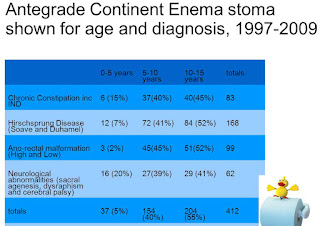
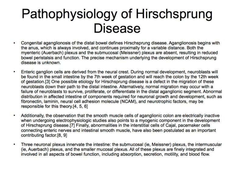
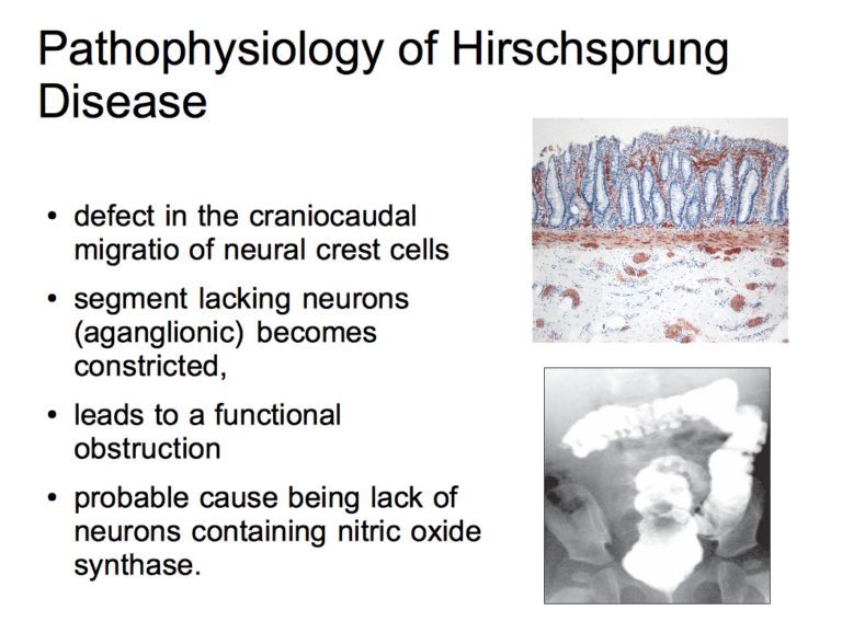
I’ll talk you through this data slide…

Data slides usually resemble a “Where’s Wally?” picture. Presenters either offer to “talk you through” something like the worst slide in the world or simply talk whilst the audience desperately scan graphs and columns trying to derive meaning from facts. This should…

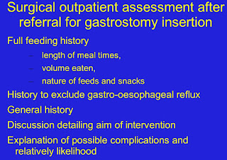
They are all the same!

It is astounding that, right now, across the world, millions of people will be sat in front of a powerpoint presentation. That is a tribute to the marketing and genius that is Mr Gates and Microsoft. What is more incredible…

Are you talking to ME?

In the movie “Taxi Driver” Rober de Niro as Travis Bickle envisages a confrontation with a mugger and the classic line, “Are you talking to me? Are you talking to me? In his mind he has worked through how the…

Welcome to the 21st Century

Holding the door for a lady, dial up internet access, travellers’ cheques and a limited number of slides in your deck are definitely remnants of times past. Some of the behaviour of the 20th Century however still persists in 2013…

With images, it’s about focus

When is an image not an image? When it’s out of focus. The effective use of images in presentations is often bedevilled by presenters failing to obey simple rules, principally though ignorance. Some of the common mistakes are more obvious…

Add a picture, that’ll make it better!

Progress along the artistic journey from Death by Powerpoint towards a more expressive and creative presentation usually starts with the thinking that addition of images will make it better. The (ironic?) clip art issue has already been addressed, even if only briefly but…

Why does good design work?

I have been struggling with the question of “Why does good design work?” All presentations (p2) are designed in that they didn’t just fall straight from the heavens. Some work and some don’t.  Those with bad design that are cut and paste jobs…