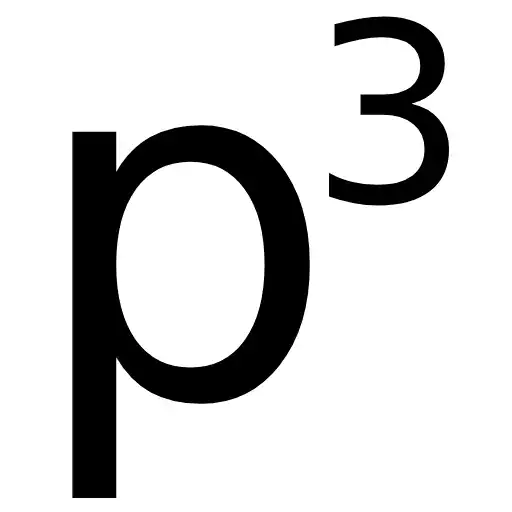

One of the more predictable criticisms of p cubed presentations is that it is all about style, just pretty pictures. The p³ approach is not about making presentations look better. It is about making presentations work better. A presentation is not the slide deck. It is not the speaker. It is not the data. It is the product of the message, the supportive media and the delivery. If any one of those is poor, the presentation fails. Beautiful slides are worthless if the audience does not understand, remember, or act differently; the presentation has not worked.
The first part of p³ is the message. p₁ always comes first. Before PowerPoint is opened, before the template appears, before the first graph is dragged onto a slide, the presenter has to decide what the audience needs to understand. What is the change required in the audience? This is why so many standard presentations are poor despite being accurate. They contain information but lack a message. The speaker has confused coverage with communication, and the audience leaves with the vague sense that something was presented, but little sense of what mattered. A simple test is uncomfortable. What are three facts that you remember from the last presentation you attended? The reason you struggle is that, if you even remember the last presentation, there was no clear message.
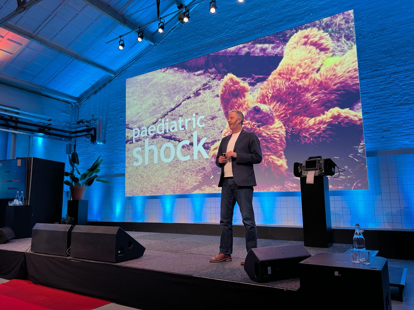
A p cubed presentation uses cleaner, simpler and more visual slides. The purpose is cognitive, not aesthetic. Cognitive load theory and multimedia learning both point in the same direction: people have limited working memory, and poorly designed slides waste it. When a presenter shows a dense slide, apologises for it, and then talks over the top of it, the audience must choose between reading, listening and trying to work out what actually matters. Supportive media should help the audience process the message, not provide a written record of everything the speaker intends to say. Simplicity is not decoration, it is function.
The third part of the concept is that p₃, the delivery, is fundamental, not additional. A presenter who has built a clear message and supportive media should not read the slides, hide behind the lectern, or perform a theatrical routine. They must connect the audience to the idea. That may involve pace, silence, emphasis, questions, examples, or story that makes the data matter to the audience. The point is not to entertain but to assist processing of the message being delivered. Poor delivery will sabotage the whole, no matter how eloquent the message or pretty the slides are.
p³ is not about aesthetics. It is about refusing to pretend that data alone is enough. In medicine, science and education, we often defend poor presentations by claiming that the material is serious. Serious material deserves effective communication, not dense slides, unclear structure and reluctant delivery. Although a p³ presentation may have slides that are considered “pretty” they are the reflection and integral part of a well-designed message, media and delivery.