A bad data slide is not made better by adding a red rectangle. It appears to be the latest fashion in presentations. Clearly some folk have “found” the animation function but the reality is that simply using a red rectangle to “highlight” an area of interest in a complex data slide does not actually make things better. It probably makes it worse.
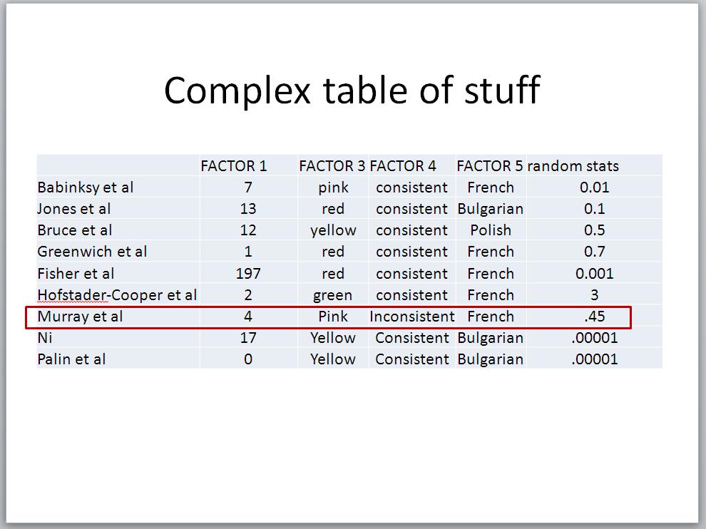
Data slides should be easily interpretable, ideally within 3 seconds, and none of the surrounding data should distract. (The reality is that even you, knowing nothing about this slide have already assessed areas outside of the red rectangle.) The purpose of the slide is not to give the audience an opportunity to undertake analysis of the figures; that was the role of the researcher. The purpose is to highlight a single set of figures to support the statement around that fact. A slide, filled with data will allow or encourage the audience to read and consider that other data. That is not the purpose of the presentation.
Perversely, the red rectangle often focusses attention to everywhere BUT the area identified. The audience will consider that that area is easy to return to and therefore the other areas need specific consideration for its exclusion. This will almost certainly be at the expense of listening to the spoken delivery.
Rather than consider how this data might be presented differently, the question is better reframed, “Why do you want to present all this data on a single slide?” If it was simply to highlight that Murray et al had a p value of 0.45, this is easily spoken with greater clarity and without the chance of the audience being distracted by Palin et al having hugely significant results. If multiple facts are to be highlighted from the data, these might be better dealt with individually and illustrated, not annotated in a different manner in the single slide.
It is essential to consider that a presentation is very different to a written document in its purpose. This is not to patronise an audience or withhold data but to ensure that they follow the planned arc of the presentation to the endpoint constructed by the presenter. (Just to prove a point, you looked to check the data on Palin, didn’t you?) If data is presented in this manner, that sureness of direction will often be altered and may result in attention being changed to factors that are outwith the presentation and lead to an erroneous conclusion being drawn. Supportive media should support the message, not distract.
Pingback: A scientific presentation at BBTS Conference - p cubed presentations