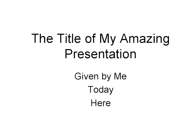
Justify your title, don’t center it. I know that’s what the template does but that means there are probably 20 million just like it being delivered today. The centre justification draws the eyes into the middle of the slide and due to the decreasing number of words per line, down the slide so the catch is either “Today” or “Here”, neither of which is actually important.
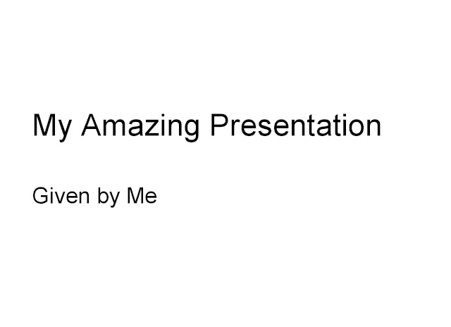
Use the text justify button and (ideally) line up the text on the left of the slide. The catch now is “Amazing” and holds the eye for longer as it is easier to read: we read from the left. It is a simple design tip that changes the feel of the presentation straight away.

