If you want to read a journal article, download it. If you want the audience to read the same article, offer it as a download. If you want to offer the reference for future reading, make it available as a download. Don’t put it on the screen. It can’t be read, it can’t be saved and there isn’t time to note down the reference. A journal article on the screen during a presentation really is not valuable. Find a better way.
Flares, perms and legwarmers were fashion statements (mistakes?) that have not stood the test of time. Screenshots of a journal article are a similar fashion faux pas. Fashion in that audiences see them at a presentation and believe that it may be worthwhile when they subsequently present to show a reference by actually putting the article on the screen. Faux pas in that it really doesn’t work. Just because everyone is doing it doesn’t mean that it works.

The discussion over text on a screen and the audience reading it has been covered many times. It simply does not work and introduces multiple opportunities for distraction. The proof of this is that beyond you noticing the article above it is highly like that you read more than than the title. Why you would do that, in a blog post on presentations is beyond me but clearly demonstrates how easily distracted audiences are. In addition you probably tried to make sense of why that article was chosen, what it has to do with this topic and even read some of the article. Audiences are easily distracted.
There is of course no question that this article is valuable. (Check the author) Discussion of the key points will of course add to the presentation being given but the visual distraction whilst that discussion is ongoing will be a challenge to the audience due to cognitive load. If it is important to reference the article do not simply show swathes of text but consider IF illustration is required and what that should be rather than simply a picture of the piece itself.
The other fashion currently sweeping the nation is the tiny reference at the bottom of a page. This is similarly useless. The reference to this seminal paper is at the top of the screen above. Why not go back and write it down. You have 10 seconds. That is the time I am going to spend discussing the paper and after that will move to the next slide. If you haven’t found the reference quickly it is highly unlikely that this will be copied down correctly and it is more likely you will be distracted from the discussion continuing as you attempt to write down the reference. If it is explained that the article is about the Common Scoter and that the reference was available for future discussion by a download, the use of a customised url from url shortner tiny.url.com allows you to generate something memorable. All the audience has to remember is “Common Scoter” the topic at hand. And continue to concentrate on the message being delivered.
http://tinyurl.com/commonscoter
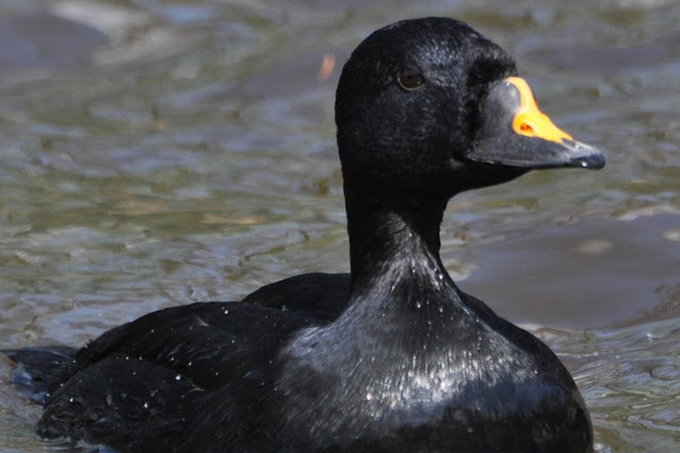
How one would illustrate this section of a presentation is of course open to discussion and artistic choice. It would depend on the purpose of the discussion at hand. The topic of the paper, the example use and the illustration to support that are all influenced by the purpose of the presentation and the needs of the audience. The duck looks a little angry. It is a Common Scoter. That is the rarest duck in the United Kingdom and not common in the slightest, thank you very much. Perhaps a good analogy for remembering that although common things happen commonly, sometimes we mistake them for the rare things. Just because it is common to show pictures of journal articles doesn’t mean that it is the best.
Pingback: Länkar v51 | Internmedicin