This is a pie chart.
This a terrible way of showing the difference between the voting in Iowa and Utah. Quick clue, it’s the bluey one and the dark green one
Seriously, there are MUCH better ways of displaying data. If you can’t see almost immediately from the image, it isn’t worth using a pie chart. The reason we use pie charts is that they are currently fashionable. Ten years ago it was three dimensional bar graphs, before that two dimensional bar graphs. Pie charts are just the latest fashion.Fashion is fine. Sort of. The point about pie charts is that they don’t work. A bit like shoulder pads. Or fizzy perms. Mostly the problem with pie charts is that they are visually inaccessible. We are unable to effectively gauge the difference in size of degrees of an arc where length of a bar is much easier. Moreover the issues of colour and identification of separate arcs is often impossible.
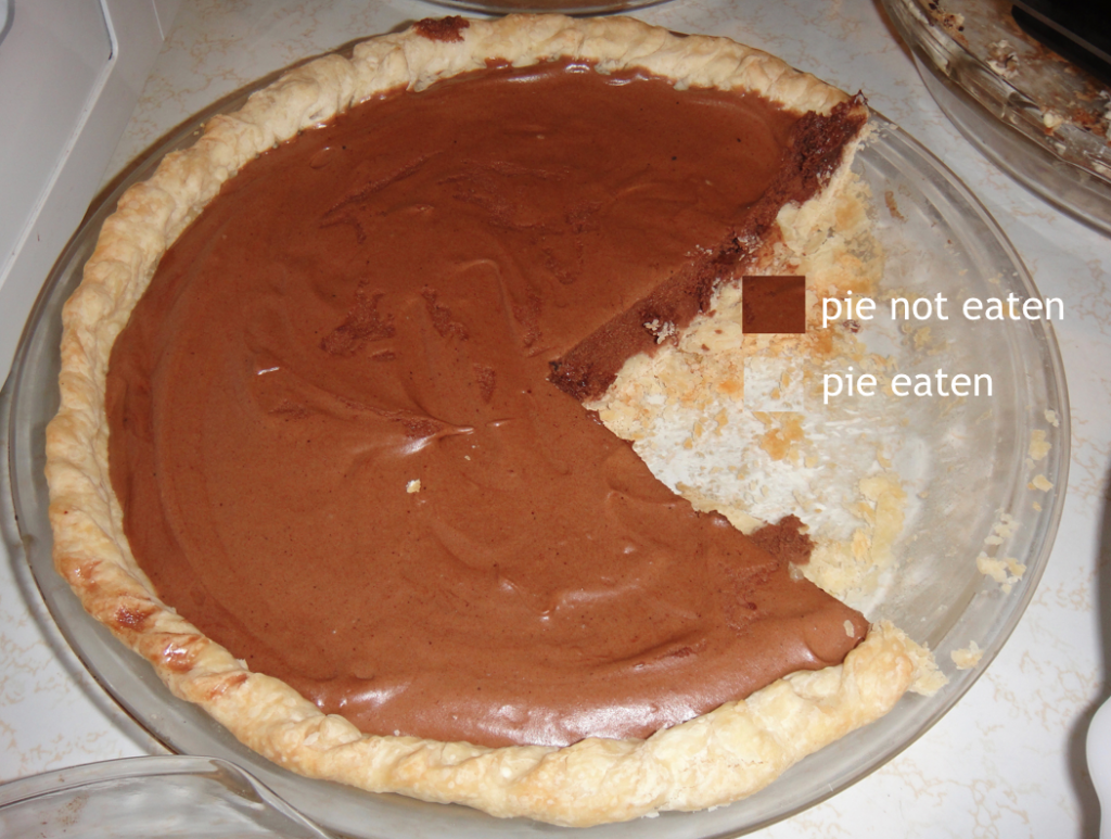
This is the only pie chart that works. No more than three segments can be effectively viewed. Don’t use pies in presentations, eat them.

