One word for templates. No
If you want to give a great presentation, don’t use a template. There are so many problems with templates that detract from a great presentation adding noise to the signal. The need for “branding” fails to understand the nature of branding and more often than not people actually misuse the template and add to their trouble. A template will not help you give a great presentation.
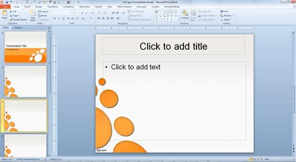
The principal problem with a template is that it adds noise that distracts from your signal. Template backgrounds reduce slide “real estate” adding clutter before anything is added. They add conflict to fonts and colour choices and further visual distraction to any images you add. The decorative effect is seldom helpful to the message and frequently confuses the viewer. Clarity of signal is key to a great presentation.
Branding is a complex issue that principally is about identifying uniqueness and not simply identification. Multiple icons identifying various institutions appearing on every single slide do not add to your presentation. As one colleague pointed out, “It is highly likely that you will still be at the same institution at the end of your presentation as you were at the start.” Those icons on every other slide are greatly distracting. Think of any brand you are aware of and the reality is that adverts or the product or the company use a great deal of subtlety to suggest and remind you of the brand, not constantly bombarding you with their name and icon. The effect of branding matters but subtlety is more effective that brute force.
Font and colour are often key to branding giving consistency across a presentation (document, stationery, clothing etc). The imposition of this onto a presentation is not always effective to the message. Worse, is the conflict by using two conflicting fonts, one in a template and another in personal design. Consistency is key.
Finally, some presenters almost ignore the template dropping images and font onto a canvas they perceive as effectively blank. This leads to text overlaid on icons, washing off the edge of an imposed text area, distracting from image composition and delivering a messy and “noisy” slideset.
There is value in constructing a personal template to ensure uniformity of font and colour across a slideset but realistically, if you want to give a great presentation do not use a template anyone else gives you.
