I have previously commented, perhaps too obliquely, on the poor nature of data slides. Trying to be reasonable however, the presenter who simply puts all their text directly onto powerpoint is going to do exactly the same with all their data. It really isn’t their fault; they believe that this is effective.
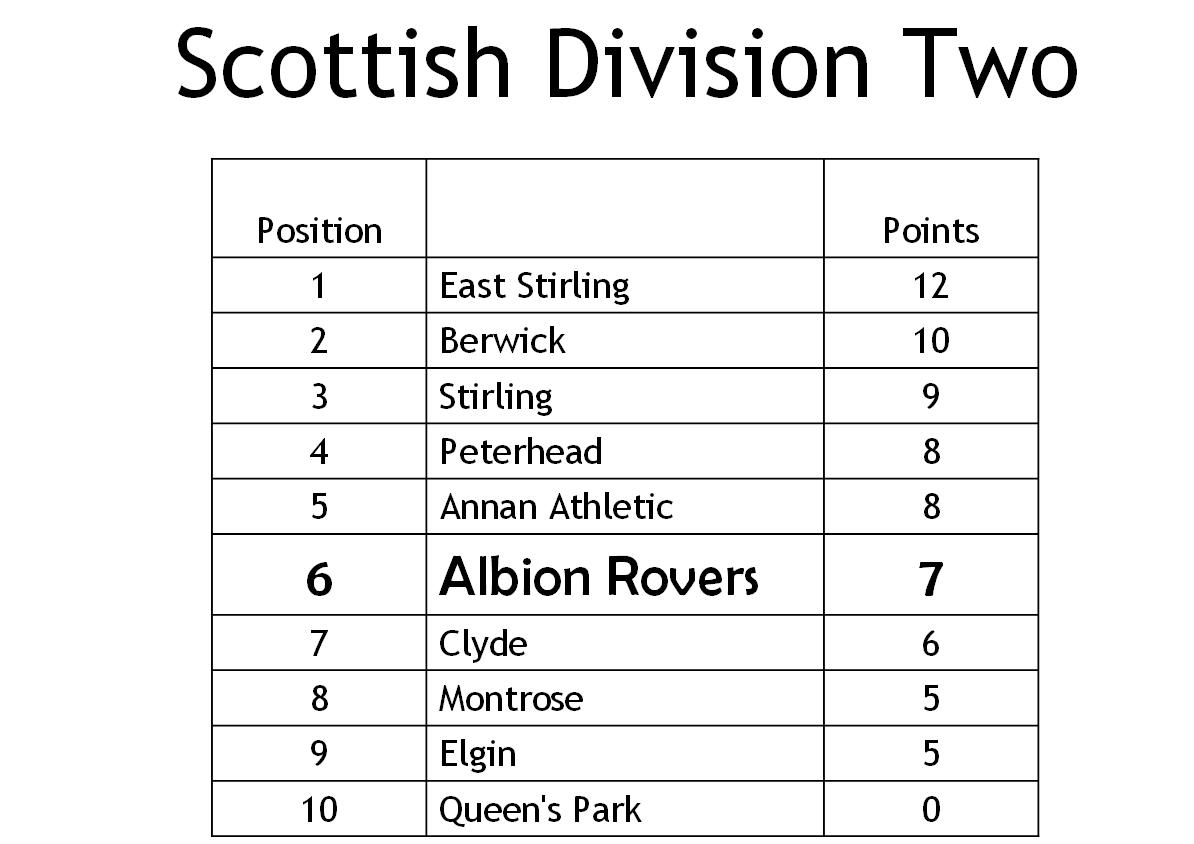
Here’s an example. The data is derived from Scottish Football Division Two. This is the current league table. I want to tell you about my team’s current position.
| Scottish Division Two | P | W | D | L | F | A | GD | Pts |
| East Stirling | 5 | 4 | 0 | 1 | 12 | 7 | 5 | 12 |
| Berwick | 5 | 3 | 1 | 1 | 11 | 4 | 7 | 10 |
| Stirling | 5 | 3 | 0 | 2 | 7 | 6 | 1 | 9 |
| Peterhead | 5 | 2 | 2 | 1 | 10 | 8 | 2 | 8 |
| Annan Athletic | 5 | 2 | 2 | 1 | 9 | 8 | 1 | 8 |
| Albion | 5 | 2 | 1 | 2 | 6 | 6 | 0 | 7 |
| Clyde | 5 | 2 | 0 | 3 | 5 | 6 | -1 | 6 |
| Montrose | 5 | 1 | 2 | 2 | 8 | 8 | 0 | 5 |
| Elgin | 5 | 1 | 2 | 2 | 7 | 10 | -3 | 5 |
| Queen’s Park | 5 | 0 | 0 | 5 | 2 | 14 | -12 | 0 |
Displayed graphically this is:
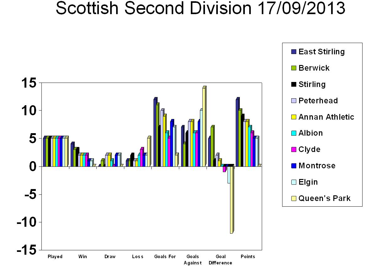
All the information is there but it is impenetrable, for many reasons.
FOCUS!
This is much improved. (Although the 3D is redundant)
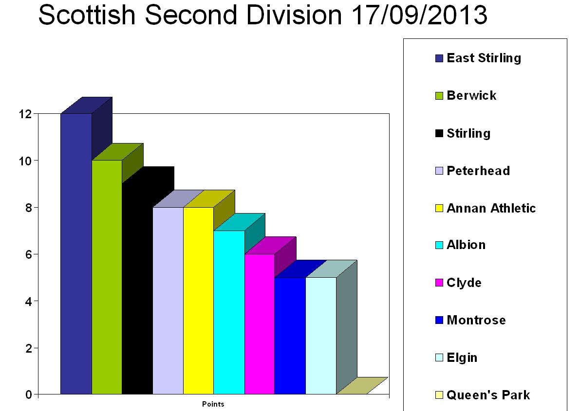
One might ask whether the rest of that data is pertinent. It clearly is and does define the position but if one is simply saying that the team is currently struggling despite previous glories (sic) one might use this slide and saying, “Rovers are currently 6th in the league with only 7 points. They’re 5 points adrift from the leaders, East Stirling.

Simply presenting data does not make it accessible. What exact point are you trying to convey? Convey it, don’t obscure it.