The use of charts to visually display data is helpful in a presentation. Care is required to ensure that the correct message is transmitted. Pie charts are currently dominating presentation screens. Importantly they often (unintentionally) misrepresent data.
Consider the following charts of market share for the four divisions of a company. Quickly glance at the image and decide which division has the highest share?
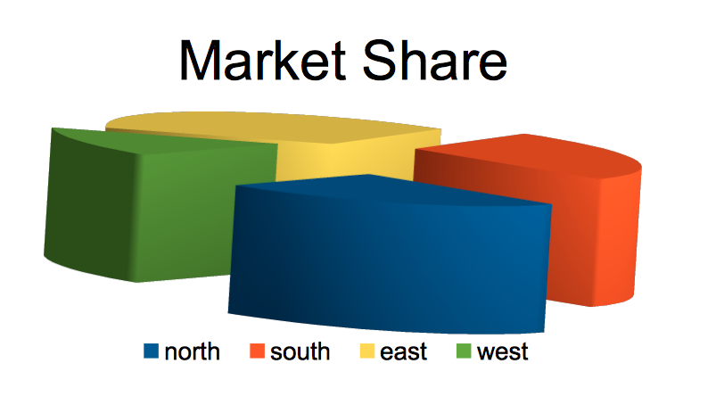
Consider this second graph and decide between north and south which has the higher share of the market?

Even the 2D pie below makes it very difficult to differentiate at a quick glance between blue and red.

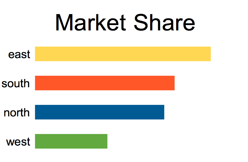
Now consider the simple, two dimensional bar chart below. All charts are made from the same data.
The literature suggests the audience have three seconds to interpret data slides after which they will stop concentrating on the speaker to decipher the slide. Pie charts are fashionable not because they are effective but because they are aesthetically pleasing.
Do not use such charts for more than than 3 items as this will break the 3 second rule. The “addition” of a 3rd dimension adds nothing but complication particularly when “perspective” is added. Simple bar charts are easiest to understand. Remember the 3 second rule, make data charts clear and save pies for eating.