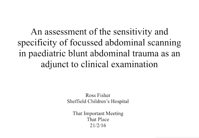
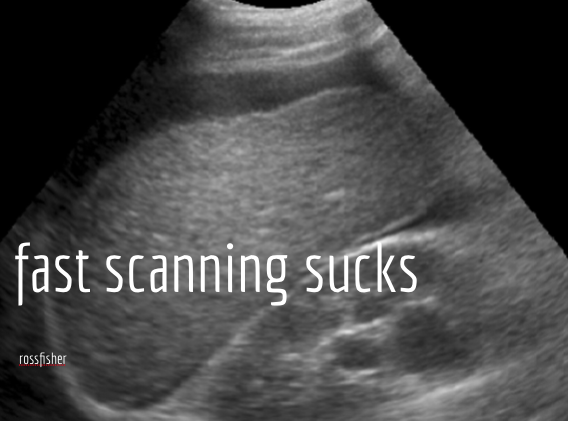
The title of your presentation must stimulate interest even before you start speaking. If the title slide is full of words and useless information it is likely you will have lost the audience at that point. A great presentation has a great title slide; there is more to that than simply a title.
This, is a poor title slide, it needs changing. The fontography and design can also be improved to add to the impact of the title slide but consider what is necessary and what detracts. Remember the speaker is always introduced and as such, much of the information in a title slide is redundant. Repeating this information does not add in any way to the message. Is it likely that the audience have forgotten which meeting they are attending, the location of that meeting or even the date? All of these details are superfluous to the message and can be minimised or removed.

Pingback: A scientific presentation at BBTS Conference - p cubed presentations