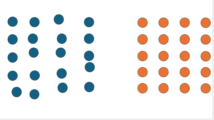
Proximity is a principle of design. It is also a principle of meaning. When items are close together, we understand them as connected. When they are distant, we do not perceive a connection. This is cognition, science, not style. There must be proximity in slide design, and in the presentation as a whole.

If a label is far from the image it relates to, the brain must work harder to understand this. If a legend is distant from the graph it describes, the data is harder to interpret. If the key message is in one place and the explanation in another, retention suffers. The design of the media brings a message together so that the brain’s processing ability doesn’t have to. This is how media (p2) can be supportive. Or not. The message, media and delivery must also have proximity to bring easier understanding and processing. This is how cognition works.
In p₁, the message must align with the structure. If the spoken message moves in one direction but the supportive media move in another, this cognitive dissonance will force the audience to choose between the two. A simple example is when a spoken value differs from the value on the slide. The viewer will be challenged, and that processing doubt further depreciates the p cubed value of the presentation.
Lastly, of course, delivery p₃ values proximity. The presenter, hidden behind a lectern, poorly illuminated on a stage, or demoted to a mere icon in their online presentation, loses proximity and is disconnected from the audience. Lack of emotion in delivery, an overly casual stance or an online camera that has the speaker looking in the wrong direction loses that proximity and the value of the presentation is decreased.
Poor presentations break proximity with a message that simply lists data. Slides that are beautiful but unrelated separate understanding from meaning. A fluent spoken message from a speaker disconnected from the audience loses impact. Great presentations have proximity.