Tag Archive: p2

type not font

type not font

Type not font influences the reception of a message. I’m grateful to my friend Bob Connelly for this guest post where he shares some ideas on the use of type in supportive media. Importantly this is about type, not font….
Read more
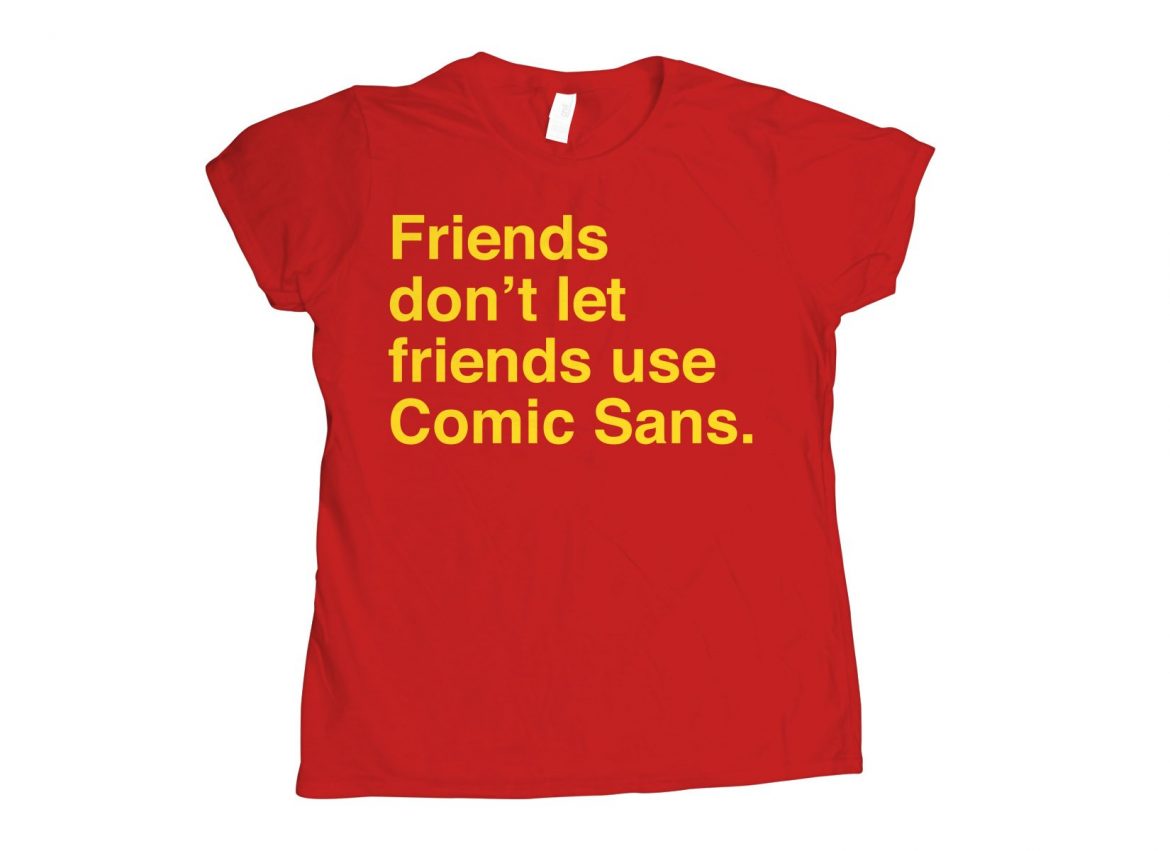
sans comic sans

Life is better sans comic sans. Fontography is a huge topic in itself. As a presenter one needs to understand that fonts “say” something and that influences the reception of a message whether that is intentional or otherwise. Comic sans…
Read more

Least important part of any presentation

least important

The p2, the supportive media, is the least important part of a presentation. It will not destroy a great story p1 or sink an excellent delivery p3. However good it can never resurrect a poor story or save a terrible…
Read more

No caption required

no caption required

In a scientific article an illustration or a figure is accompanied by a caption. There is no caption required in a presentation. Images should exist by themselves without a complex description. Conversely a slide and in fact the whole of…
Read more

Single image per slide

When constructing a slide use only a single image. The image should add to the message that is being delivered but not be the message itself. A few words can add meaning but there is no need for a title….
Read more

On generic slides

generic slides

Generic slides are designed so that “anyone can give the same presentation and everyone receive the same information.” Few great presentations are given using generic slidesand many good presentations are made worse using generic slides. Education is not simply about…
Read more

data slides (1)

data slide fail

Data slides fail in a good scientific presentation if simply copied directly from the scientific paper. A graphic representation is more easy to interpret and remember than many words either spoken or written. Or more succinctly,  “Use a picture. It’s…
Read more

Can you see this at the back?

can you see this at the back

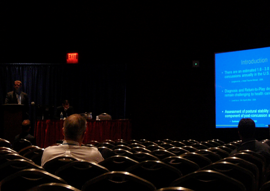
The p2 is usually constructed on a laptop or desktop computer where the final slide size often fills the screen. The size of font is reduced as more and more detail is added. What may appear clear and legible on…
Read more

Thank you!

thank you

I was recently working with a colleague who had developed an excellent presentation. The final slide was incongruous. It had a beautiful image with the words “Thank you” on it. Your last slide should be the defining image, lasting message and…
Read more

That’s not what I meant by that picture

picture

A picture can paint a thousand words. It is important that an image within p2 paints the words the presenter intends the audience to hear. A single image may have multiple meanings. It is essential to consider other possibilities may exist. Make sure…
Read more