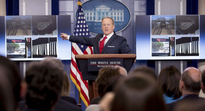
The White House Press Spokesman Sean Spicer is, sadly, not a good example of how to perform in public. Under the glare of the world’s press his performance as well as the information he delivers is scrutinised. His most recent presentation on the infamous Wall provides an unfortunate critique of common views on powerpoint presentations. This is how not to do it.
The Press Briefing room at the White House is a small room seating only 45 people. Consider the image belong, taken from the back of the room. What do you see? It’s actually very difficult to see anything. One is immediately drawn to the man, he is pointing to his right but it is impossible to actually focus on anything, attention is drawn immediately back to his face as he is looking into the audience. How many actually realised there is a duplicated screen on his left? Fewer still can actually pick out and identify what the images are contained in each screen. Further visual distract is on the podium, a message repeated behind him and then a flag. This is how not to do it.

The screen is an adequate size for the room. The images within the presentation are woefully small. It is impossible, even at this range to figure out what the images represent. They would have been much simpler to understand delivered separately. Even if one chose, wrongly, to present four images within one shot spacing out the images would have improved interpretation. This is how not to do it.
There is no need for dual projection in a room that is only 6 seats wide and 7 rows deep. The screen on the right of the speaker is redundant, made more so by his use solely of the opposite screen as seen. Dual projection does not make things clearer in fact it forces the audience to constantly scan both screens for fear that there is a difference. This will occur with every slide change. This is how not to do it.
Even a presenter Mr Spicer is failing. His body language instructs us to be aware of the screen but because he continues facing the audience they will focus on him, not the image. The use of a single, pointing finger is demonstrative and authoritarian; it is an instruction. In the interview he is berating the audience for not understanding what a wall is. Body language changes interpretation. This is how not to do it.
One might question how many of the White House Press Corp present in the White House Press Briefing Room were unaware that they were in The White House, in Washington and must have this repeated for their benefit. The flag is fairly standard for this setting but interestingly has been crammed in behind Mr Spicer as there is no space for it. This is how not to do it.
It’s not that this hasn’t been done before… Don’t crowd the stage. There is never a need for dual projection duplicating an image. Make images within slide visible from the back of the room. Four images deserve four slides. If you want the audience to look at an image, look briefly at it yourself and gesture with an open hand. That is how to do it.

Pingback: This is how not to do it – Global Intensive Care