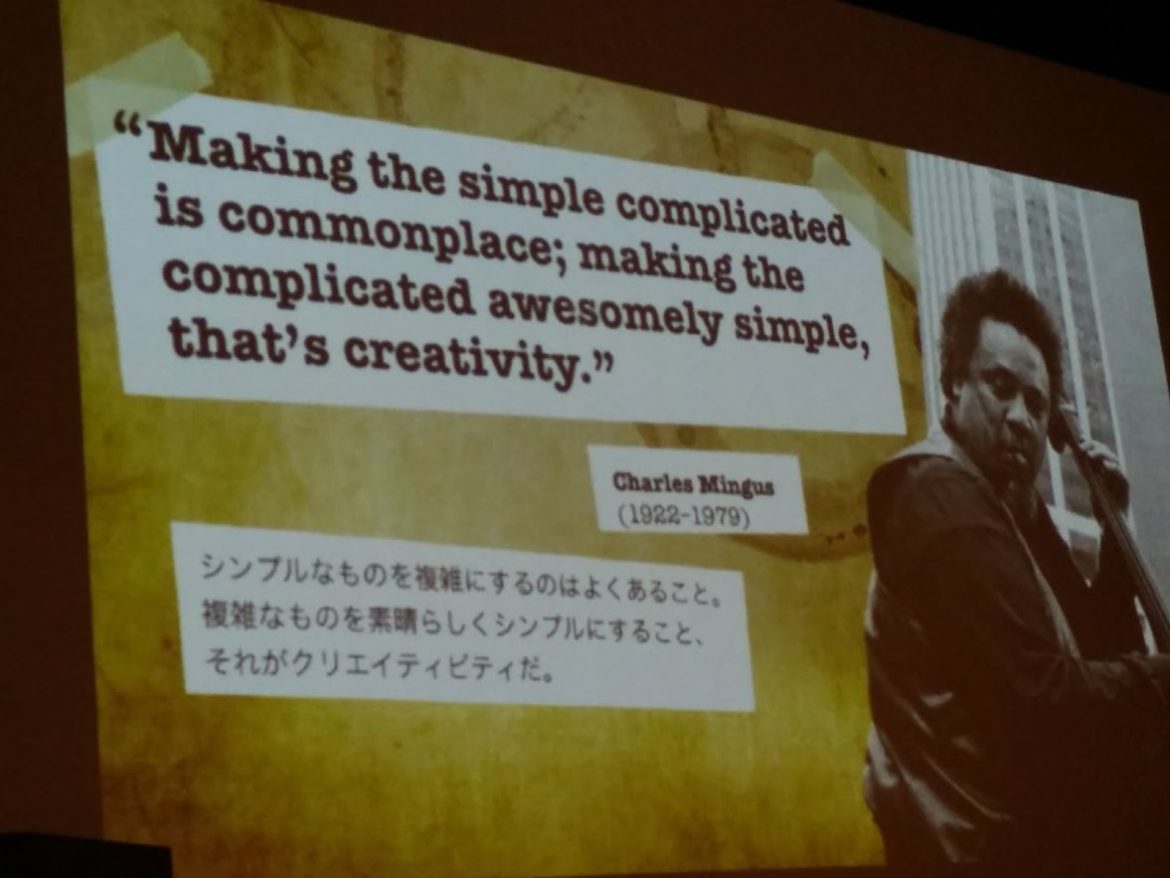
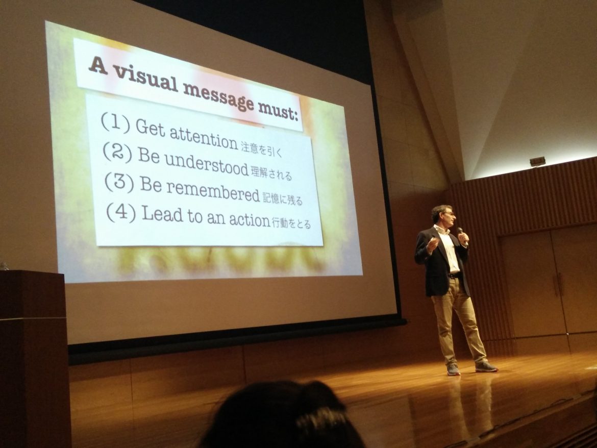
Effective communication
The purpose of a presentation is effective communication. Effective communication is not recitation of a list of facts. Effective communication is about a message. That message is only effective from the perspective of the audience. Effective communication is about converting…
Read more