Author Archive: ffolliet

At work I'm a Consultant Paediatric Surgeon. That involves Surgical Oncology, Neonatal Surgery and Trauma. There's also a lot of teaching and mentoring. None of this actually makes me particularly clever. I'm pretty heavily into improving presentations and long for the world to lay down the weapon of bulletpoints and embrace creative and engaging presentations. I lead presentation workshops and am currently working up a book on presentations. I did a wee thing at TEDx Stuttgart in 2014 of which I'm quite proud https://www.youtube.com/watch?v=qFza3W87eDg Outside all of that I struggle to keep fit, cycle a bit and the odd triathlon. I'm a father, singer, laugher, learner, sharer, blogger, thinker, strummer and much more.

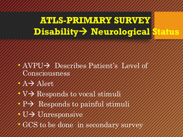
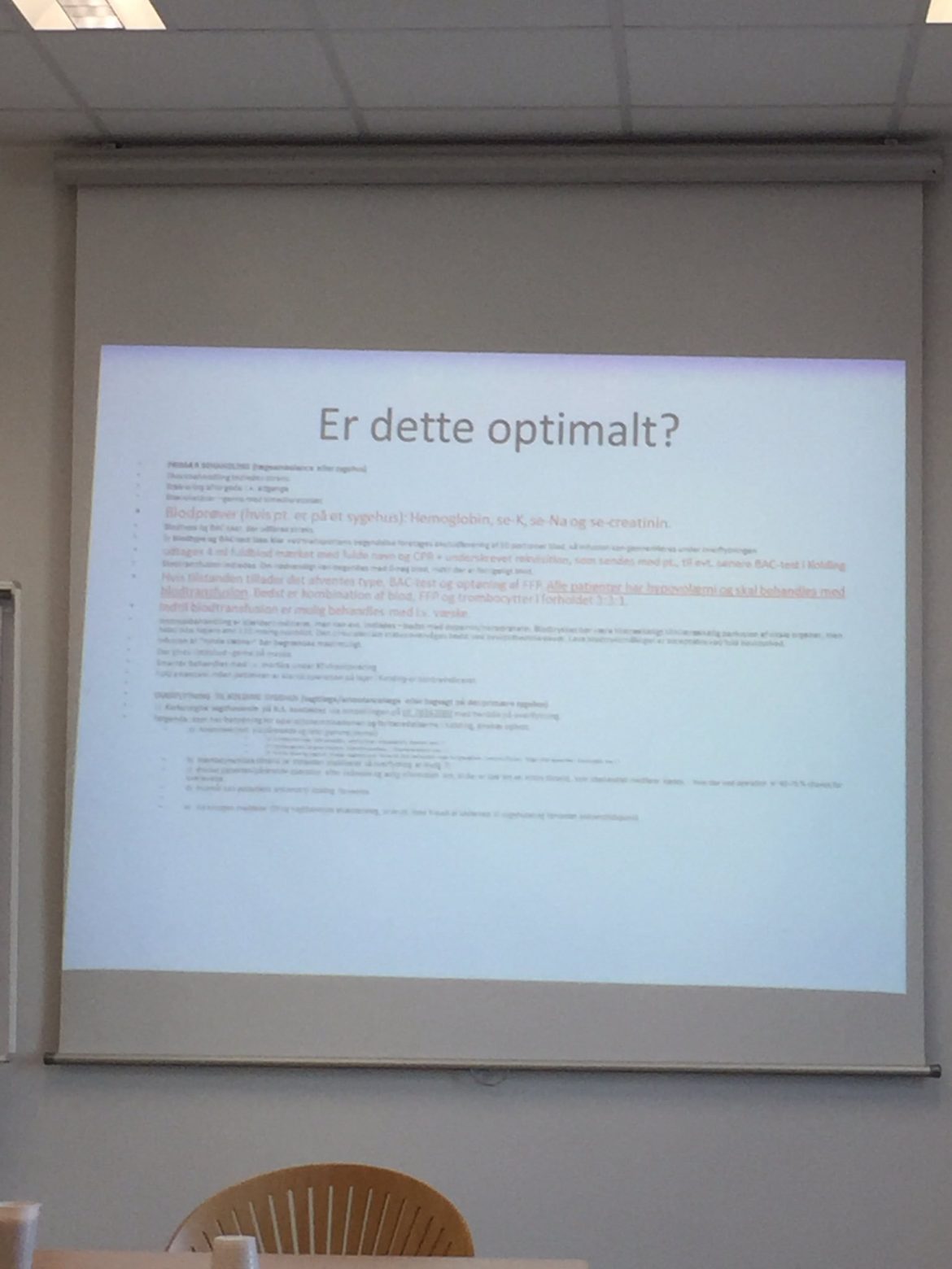
Busy slides
busy slides

“Busy slides” happen for many reasons; the script, something to read, the handout , what everyone does, “because of learning styles”, ”academic” and because it is quick and easy. They are not effective, they limit the message, they are not…
Read more
Presentations are your responsibility

your responsibility

Presentations are your responsibility. Presentation skills are not innate. Like all other professional skills, they require education, example and feedback to develop. Unfortunately, there is little education, the standard achieved is at best mediocrity and feedback for those delivering presentations is seldom…
Read more

Could you send me your presentation please?

send presentation

A simple question that belies a lack of understanding of the value of a presentation. “Could you email me your presentation please?” A presentation is the product of the story (p1), the media (p2) and its delivery (p3). A presentation…
Read more

On generic slides

generic slides

Generic slides are designed so that “anyone can give the same presentation and everyone receive the same information.” Few great presentations are given using generic slidesand many good presentations are made worse using generic slides. Education is not simply about…
Read more

On being creative

creative

It is always encouraging to engage with colleagues in social media and I try to answer questions from there. Thanks to Jennifer Wyman for raising the idea of creativity in presentations. Data slides (2) https://t.co/9Tfeh8gkXE via @ffolliet Check out the P3…
Read more

Data slides (3)

image superiority

Data slides must be easily interpreted, memorable and clear. They will support the message, not distract, cannot be taken directly from a scientific document and are best if their theme, font colour fit with the other slides in the presentation.This…
Read more

Data slides (2)

data slide 3

In the previous post on data slides it was highlighted that “Data slides must be easily interpreted, memorable and clear. Few are. Most could be improved.” A data slide in a presentation cannot merely a representation of a table from the scientific…
Read more

Hysteron proteron

hysteron proteron

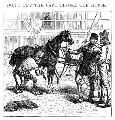
Hysteron proteron is a figure of speech, probably inherited from the Greeks, where the object that should come second is put in first place; “to put the horse before the cart.” Another example would be preparing the supportive media (p2) for a…
Read more

data slides (1)

data slide fail

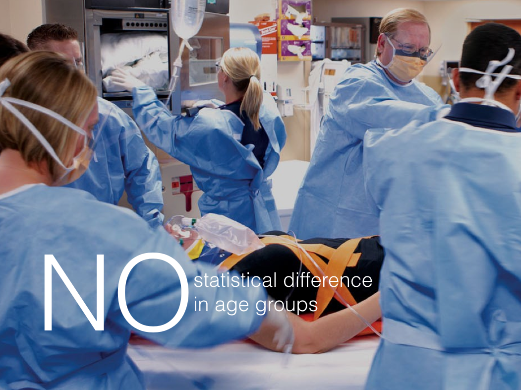
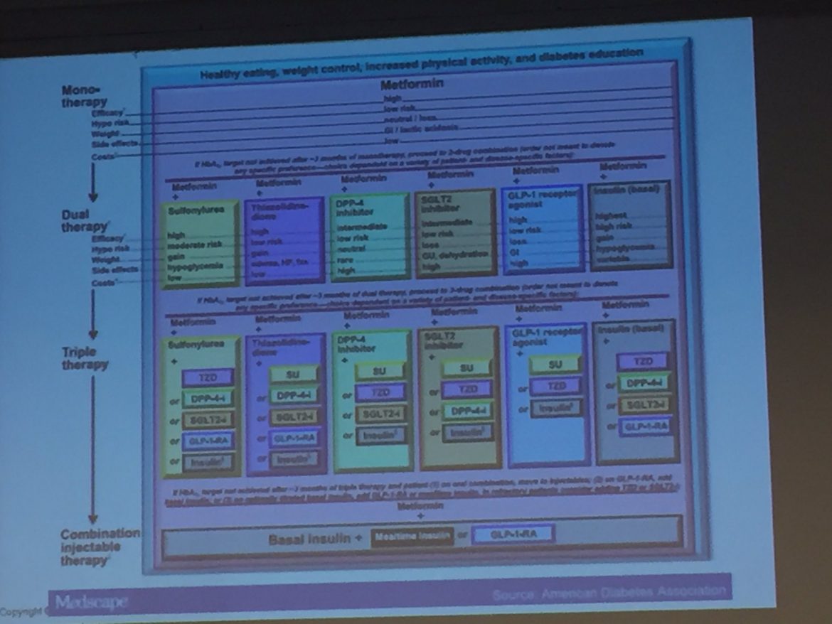
Data slides fail in a good scientific presentation if simply copied directly from the scientific paper. A graphic representation is more easy to interpret and remember than many words either spoken or written. Or more succinctly,  “Use a picture. It’s…
Read more

Effective communication

The purpose of a presentation is effective communication. Effective communication is not recitation of a list of facts. Effective communication is about a message. That message is only effective from the perspective of the audience. Effective communication is about converting…
Read more