Dual screen projection
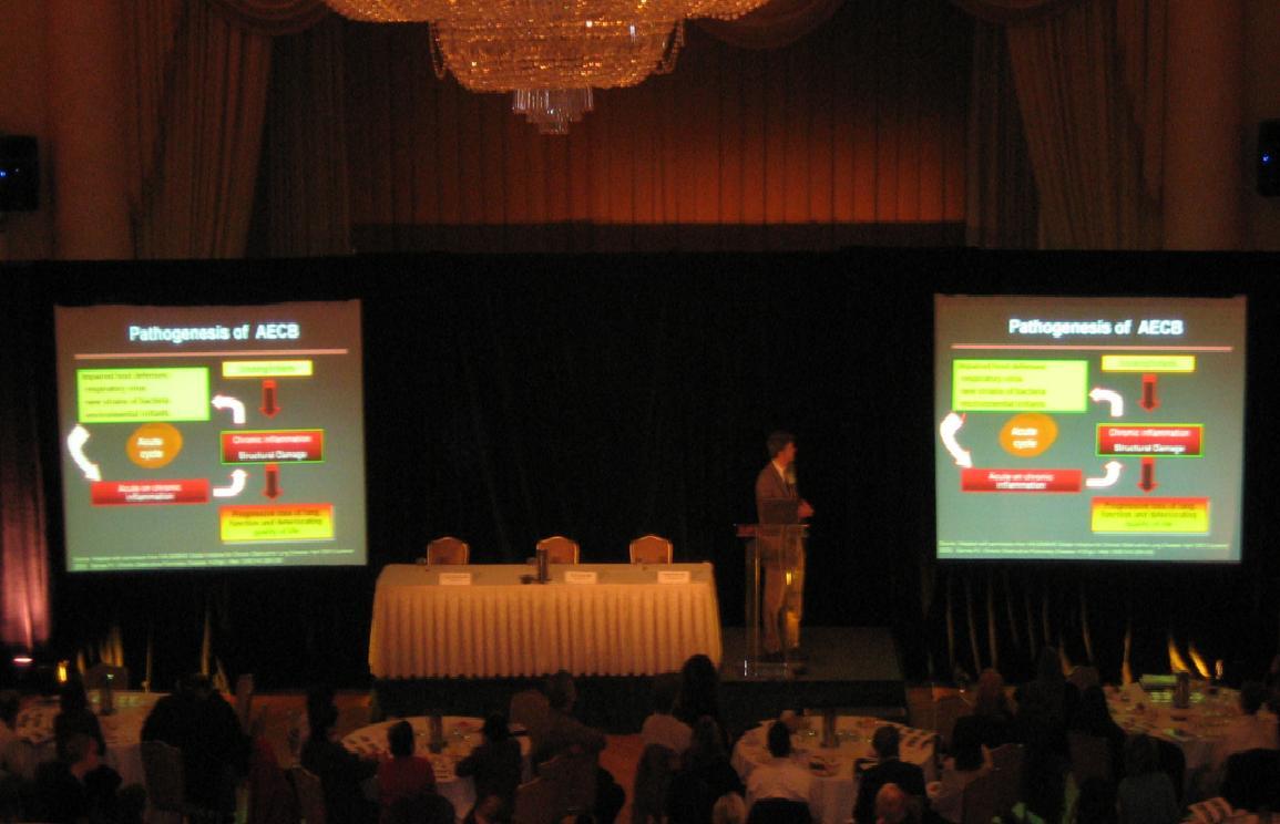
Dual projection screens showing the same image is a bad idea. It is bad for speakers and bad for the audience. Sometimes it may be necessary but if this is the only option a good speaker needs to make changes to…
Read more
every great presentation is the product of its message (p1), the supportive media (p2) and the delivery of that (p3).
Dual projection screens showing the same image is a bad idea. It is bad for speakers and bad for the audience. Sometimes it may be necessary but if this is the only option a good speaker needs to make changes to…
Read more
Think of the best scientific presentation you have watched. It captured your interest as soon as it began, asked a question pertinent to your specific needs and proceeded to succinctly answer that question leaving you with a purpose to change…
Read more
A sentence without the final word is. A journey without reaching the destination is just tiring. Sadly many presentations simply reach a point where the presenter says, “thank you” and it is assumed that the suffering is over. Every presentation…
Read more
Every great presentation has a message, one single message. The common failing in many presentations is they are simply a pile of data, a ramble or lists, not a message. When constructing any presentation one needs to determine early on…
Read more
There is little guaranteed to strike more emotion in an employee than the words, “mandatory training”. Imagine being the person delivering it? Simply take all 249 facts in the guideline and read it out, in slightly more time than is…
Read more
Intro. Waffle waffle waffle, essential and potentially key interesting information. Waffle waffle waffle. Facts. Waffle waffle waffle. Build up with more key information. Waffle waffle waffle. Punchline. A great presentation is better than a shaggy dog story; it should make…
Read more
A great presentation takes time. None of them fall from the heavens perfectly constructed and no great presenter steps on the stage having just written their piece last night. So which part of preparation took the most time in your…
Read more
This post marks the 200th in a series of little comments on #presentationskills . I started the blog in March 2013 and the current number of hits is over 120,000. Thank you for your interest!The most popular posts are listed…
Read more
Designers are clever folk and too often abused. I mean look at this from Critical Care Conference 2016. Imagine the time and effort and skill that has gone into this? It’s bright and dynamic and through the complexity some structure…
Read more