p1

p1 is the basis of the presentation. It is the data, the story, the message that the presenter wishes to deliver to the audience. This section covers blog posts that address any part of the construction of p1; taking the “what” of the data and converting it into a “so what” for the particular audience. In particular, this covers audience needs, the value of a single, identifiable message, an elevator pitch, the arc of the story and development of sparklines.

The cornerstone articles on p1 are below but please surf through the links to gain a deeper understanding of why p1 (the story) is the basis of your presentation and must be the starting point in construction.

1.Hysteron proteron – the place to start with a presentation is the message.

2. It is not acceptable or valuable to just talk, you must have a message.

3. The aim and objective of a presentation are not the same thing.

4. The best presentations are planned analog. Shut the laptop and be creative.

5. Consider principally “why” you are presenting, not what to present.
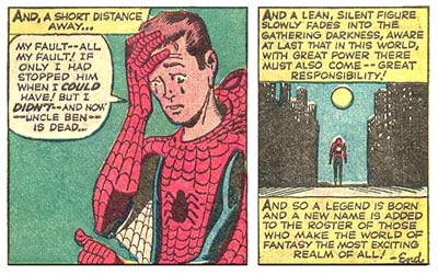
Good analogy- guest post

good analogy

A good analogy can make or break a presentation. It’s always a pleasure to share thoughts and ideas from other presenters on the site. I was pleased to receive this guest from Simon McCormick giving some of his thoughts around…
Read more

Effective communication

The purpose of a presentation is effective communication. Effective communication is not recitation of a list of facts. Effective communication is about a message. That message is only effective from the perspective of the audience. Effective communication is about converting…
Read more

p1 is not a story, but the story.

p1 is the story not a story

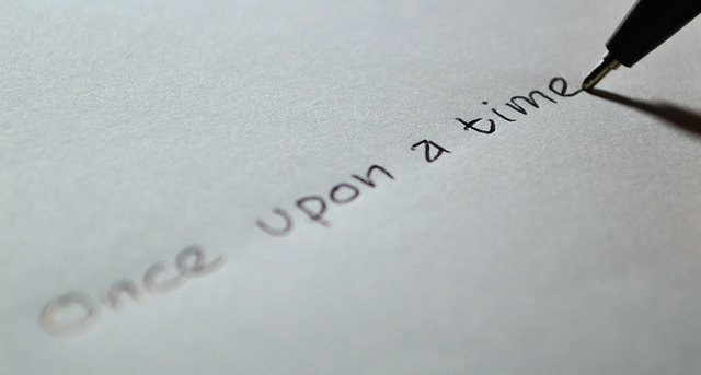
Every presentation is made up of three parts; p1 the story, p2 the supportive media and p3 the delivery. p1 is not “a” story, once upon a time or somesuch, p1, “the” story is the data of the piece converted…
Read more

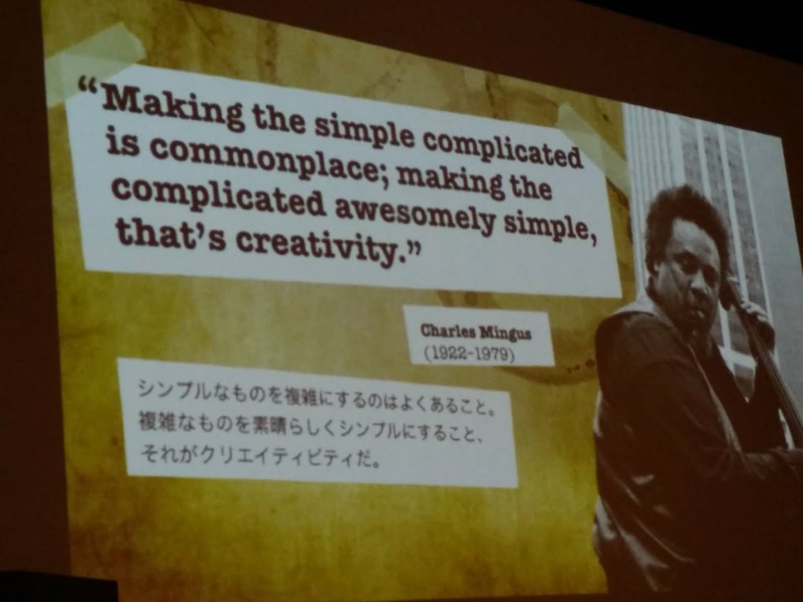
Lessons from The Sensei (4) creativity

creativity lesson

In the 4th of a series of Lessons I learned from a presentation by Garr Reynolds (my Sensei) I’d like to consider creativity in presentations. Delivering a presentation is more than reading a list of facts. Changing the facts into…
Read more

Lessons from The Sensei (3) beginner’s mind

beginner's mind

Do it the way you’ve always done it. You can do that, you’re not good enough. Where is the standard background? Not enough text. Use a pie chart. Make sure you put references at the bottom of the page. Read…
Read more

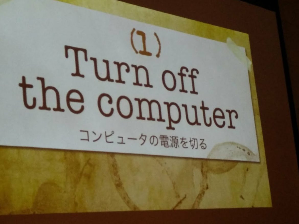
Lessons from The Sensei (2) Turn off the computer

turn off the computer

Continuing the series of thoughts I learned from The Sensei on design issues, perhaps the most important is to turn off the computer. The rationale behind this is clear, the results are immediately observable and yet few people will follow…
Read more

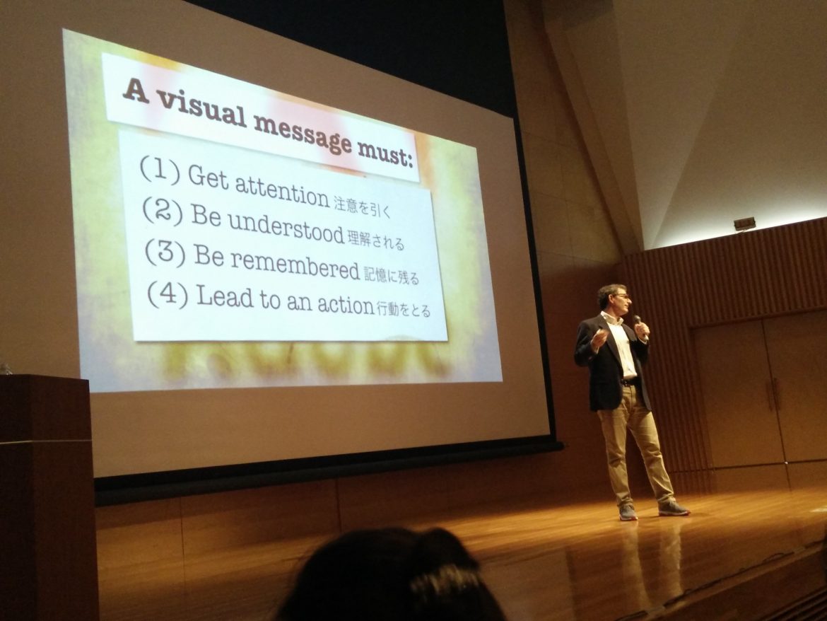
Lessons from the Sensei (i) effective visual message

lessons from sensei 1

I was privileged to spend time recently with Garr Reynolds, author of Presentation Zen and really my Sensei (Teacher) in starting my journey in all things presentation. His books are compulsory reading for anyone keen to improve their presentations and…
Read more

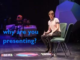
Why are you presenting?

The most important question a presenter should address is “Why am I presenting?” The answer has nothing to do with your status, your previous presentations or your knowledge and everything to do with the audience. Recognising this is central to…
Read more

Less is more. Again

less is more

Less is more. “Clean, uncluttered lines” is a design motif that appeals aesthetically. The same should be applied to the story (p1). More words, more facts, more explanation does not make more clarity, rather the converse. The aim should be to deliver…
Read more