Type not font influences the reception of a message. I’m grateful to my friend Bob Connelly for this guest post where he shares some ideas on the use of type in supportive media. Importantly this is about type, not font. Thanks Bob.
Many people think that improving the p2 of your presentation means getting rid of bullet points and replacing them with pictures. While I welcome any movement to rid presentations of “slideuments”, text still plays an important role in illustrating the key message of your presentation. And when it comes to adding text to a presentation slide, the most frequently asked question is “What font should I use?”
Think Type Rather Than Font
Instead, I recommend that you ask a different question—how do I best leverage the use of text in my slide? Doing this involves two components: choosing type and using type.
Choosing Type
We have an abundance of choices of typefaces today, from those pre-installed on our computers, available for free on the Internet and for purchase from type foundries. These choices can be overwhelming. Many, in the quest of looking for something unique, have made poor choices for presentations. So how do we navigate through these choices?
David Underwood, a professor of Graphic Design at the University of Colorado at Boulder offers two simple rules:
- Choose the typeface that reflects your messages and not your personal taste.
Just because you think Comic Sans looks cute (and different from the boring Calibri that everyone seems to use), does not mean it is appropriate for your talk on end-of-life care, even if you are talking to Pediatricians!
2. Let your best work be reflected by the best work of the experts: stick with the classics.
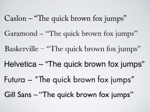
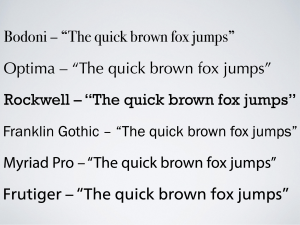
Classic typefaces remain timeless for a reason: they work well. Although I am a self-professed typography nerd, I am not an expert. I rely heavily on the recommendations of expert designers for choosing typefaces for my presentations. Here are some suggested typefaces from two highly-recommended experts:


| Recommendations from typography expert, Ina Saltz |
Recommendations from presentation expert, Garr Reynolds |
Using Type
Some rules on using type:
- Limit text on your slides. Remember that whatever text you put on your slide needs to be read quickly (with just a quick glance).
- Stick with one typeface. I would recommend only using one typeface that has a number of weights (regular, medium, semi-bold, bold, etc).


| Helvetica Neue is one of my go-to typefaces. It is based on the classic Helvetica typeface and has a wide range of weights to use. Here are samples of slides using UltraLight and Medium (left slide) and Bold and Thin (right slide). | |
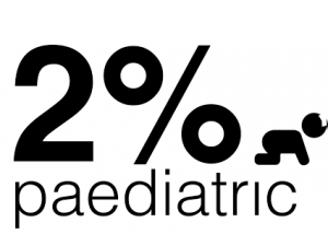
- 3. Exploit contrast in your type. Think of how you can change the type elements to make your message easy for the audience to see. Make the important word(s) much larger, or in a heavy weight, or in a different colour.
  |
|
| These are sample slides, taken from presentations that Ross has given. On the left, this slide uses contrast in both weight (bold vs regular) and size to make the statistic stand out. In the example on the right, the dramatic picture captures your attention. By being strategically placed in line with the infant’s eyes, your eyes are directed to the statistic that is further highlighted by contrast not only in size but in colour. | |
In summary, choosing a typeface is relatively straightforward—stick with a classic typeface that reflects your message. More importantly, pay attention to how you can use the attributes of type—colour, size, weight—to make the message easily seen by your audience. Remember type not font, for Bob’s sake.
Pingback: type not font – Global Intensive Care
Totally agree on Helvetica Neue – I think it provides probably the widest range of options of weights and looks ‘current’ probably because it and very similar variations are used so much in advertising and on TV at the moment. I do think though at some point it will become to look ‘so yesterday’ and I will find myself moving on to something else.
I’m fairly centered on Gill sans altho issues of its provenance starting to irritate me.
Time for a ffolliet Sans typeface? 😉