Search Results for: data slides

Number of Results: 86

Seven Deadly Sin of Presentations

No matter how amazing your research is, how life changing your story was, how impressive your business case is, if you commit any of the following deadly sins in the construction and delivery of your presentation it will not received…
Read more

Less pies

The use of charts to visually display data is helpful in a presentation. Care is required to ensure that the correct message is transmitted. Pie charts are currently dominating presentation screens. Importantly they often (unintentionally) misrepresent data.Consider the following charts…
Read more

Herding chickens

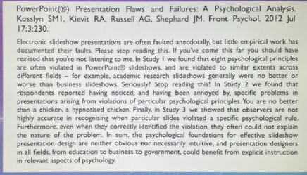
The major drawback of text on screen is that the audience cannot help but read it. Mountain View Ca. They are hypnotised like a chicken. It is important in construction of p2 (the supportive media) to remember that one’s audience,…
Read more

Increase signal to noise ratio

One of the key concepts in improving your presentation is to increase the signal to noise ratio. This applies to all parts of the presentation; p1, p2 and p3. It’s like tuning the radio properly, the clarity of the message…
Read more
Take a chance.

It is my pleasure to introduce another guest blog this time from a twitter friend @Liz_ORiordan on her experiences with a different approach to presentations than the “tried and tested” method. “Hello, my name is Liz Ball, I’m a Consultant Breast…
Read more

Guns don’t kill… bulletpoints do.

Tedious slide after tedious slide, read out almost verbatim with accompanying data slides that are too complex, don’t project well and are impossible to understand. There’s a random cartoon culled from somewhere but we can’t read it because it’s distorted…
Read more

One change for dramatic improvement. (you won’t do it!)

I’m rather hoping that frequent visitors to the blog will have taken to heart some of the important concepts of presentation. Perhaps my deepest insight has been the p3 concept. The success in delivering the message of “the presentation” can be…
Read more

Welcome to the 21st Century

Holding the door for a lady, dial up internet access, travellers’ cheques and a limited number of slides in your deck are definitely remnants of times past. Some of the behaviour of the 20th Century however still persists in 2013…
Read more

Where’s Wally?

The point of a data slide is a quick, easily interpreted, graphic representation of numerical data. The audience should be able to grasp the meaning themselves within seconds, ideally without guidance or explanation from the speaker.Unfortunately it is more often…
Read more

Dance on the radio

Dance is a beautiful medium conveying story, emotion, and passion. Radio is ubiquitous, free, and a perfect way to communicate effectively, widely, and efficiently. Dance on the radio does not work, no matter how much we love both. Nothing from…
Read more