p2

The supportive media (p2) is everything that adds to the story (p1) in its delivery(p3) whether as a presentation or visual aids. If you have visited the site looking for tips on using powerpoint, you will be disappointed. The discussion is around design concepts, use of text in slides, images and data slides used to illustrate and support the message. It is the least important part of a presentation and some presentations may even be better without slides! Most importantly, the .ppt file is not your presentation.

Cornerstone posts include.
purpose of the p2

basic type choices

when to construct the p2

design matters

don’t overlay

don't overlay

Don’t overlay multiple images. Images can only be viewed in isolation. Superimposing one image over another is visually confusing and may lose the value of both. Consider carefully if all images are required at the same time and either fully…
Read more

What colour is a zebra?

What colour is a zebra? Is it white and black stripes or black and white stripes? Ask Marty, the funky Zebra from Madagascar. When it comes to slide design a question that comes up often enough in discussion relates to…
Read more

retro fitted

retro fitted

Retro fitted presentations are really not very good. If you have constructed (and delivered) a presentation and have decided to carry out some of the p cubed concepts in your work, the best advice is not to retro fit an…
Read more

format changes

format changes

Format changes often when a presentation is moved from one computer to another. This is the cause of quite a few nervous starts, anxious half hours and embarrassed deliveries. Make sure everything that the original presentation moves to the podium and…
Read more

type not font

type not font

Type not font influences the reception of a message. I’m grateful to my friend Bob Connelly for this guest post where he shares some ideas on the use of type in supportive media. Importantly this is about type, not font….
Read more

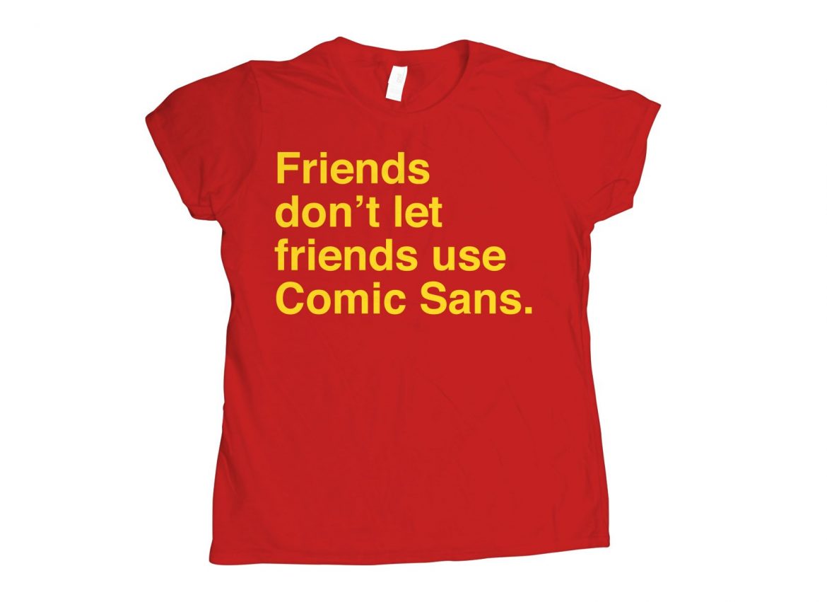
sans comic sans

Life is better sans comic sans. Fontography is a huge topic in itself. As a presenter one needs to understand that fonts “say” something and that influences the reception of a message whether that is intentional or otherwise. Comic sans…
Read more

Least important part of any presentation

least important

The p2, the supportive media, is the least important part of a presentation. It will not destroy a great story p1 or sink an excellent delivery p3. However good it can never resurrect a poor story or save a terrible…
Read more

No caption required

no caption required

In a scientific article an illustration or a figure is accompanied by a caption. There is no caption required in a presentation. Images should exist by themselves without a complex description. Conversely a slide and in fact the whole of…
Read more

Single image per slide

When constructing a slide use only a single image. The image should add to the message that is being delivered but not be the message itself. A few words can add meaning but there is no need for a title….
Read more

On generic slides

generic slides

Generic slides are designed so that “anyone can give the same presentation and everyone receive the same information.” Few great presentations are given using generic slidesand many good presentations are made worse using generic slides. Education is not simply about…
Read more